Monday 24 June 2013

Papertrey June Blog Hop Challenge

 
Stamps: Lovely Layers, Boxes Bags & Tags, Tin Types (PTI); It's Your Day (HA); Basic Borders (ME)
Ink: Tangelo, Morocco, Rose Bud (Memento); Versamark (Tsukineko)
Other: 2" circle punch; white & gold e.p. (WOW)


This card is for PTI's June bloghop "A Touch of Gold".  To make the medallion, I scanned in my Lovely Layers set, then used Silhouette Studio to trace, replicate & rotate a particular image 3 times.  I then welded these together  & added an offset outline.  I cut it out, stamped & embossed it, then wound gold thread around to create the 'net' pattern.


My favourite part of the card, however, is the glossy faux brads.  The small ring stamp from Boxes, Bags & Tags was stamped in versamark & embossed with gold.  I coloured it using a blender pen with the same inks as the medallion, then punched it out with a 1/4" hole punch.  After sticking in place on the card I added glossy accents for the final touch.  The embossed rim enabled me to spread the gloss around with a pin without going over the edge.
 
Am also entering this for Less is More this week, although I'm not entirely sure it's quite 'less' enough!
 
Linking to:

Wednesday 19 June 2013

Birthday fishes

Stamps: Tremendous Treats Valentine (PTI)
Ink:Pear Tart, Bahama Blue, Tangelo, Morocco (Versamark); Versamark (Tsukineko)
Font: Migraine Sans
Other: Spots embossing folder (Cuttlebug); White ep (WOW); aqua promarker; Diamond Stickles; tracing paper
Today's offering was inspired by this Make It Monday video.  I had hoped to enter, but on closer inspection you must use flowers.  Fish don't count.

EDIT: have seen other crazy wild rule breakers have entered non-flower cards, so am giving it a go.

Linking to:
CASology: Week 49 ~ Fish
Make It Monday: MIM 121 ~ Coloured Vellum

Sunday 16 June 2013

What do you see?

Stamps: It's Your Day (HA)
Ink: Aqua (Ranger Adirondack); Blue Danube, Lulu Lavender, Lilac Posies, Espresso Truffle (Memento)
What pattern do you see in the above?  Stars?  Stacked boxes?  Hexagons?  Mostly I see the boxes.
 
I have made a great discovery this morning.  Tracing paper makes the best stencils.  I created an overlapping hexagon pattern with Silhouette Studio, & cut it out of tracing paper.  I then sponged over the stencil with a variety of inks.  The stencil gave nice crisp lines, no bleeding & no soggy bits - I'll be able to use this one again.  I also like the effect of the sponging on the linen textured card stock.
 
Linking to:
Less is More: Week 124 ~ Hexagons

Wednesday 12 June 2013

Father's Day

Dies: Stars (MFT); Pennants (Spellbinders)
Font: Ecuyer Dax, Stars from their Eyes
Eek.  Father's Day on Sunday & nothing suitable in my stash.  Quick - to the laptop.  The ombre HAPPY was a direct CASE from this week's Make it Monday at PTI.  (My son was looking over my shoulder at the time: "I know where you got THAT from Mum").  Printed out twice.  Die cut the spare & coloured with promarker.  No coincidence that this week's CASology is YELLOW.  Stick it all together, take a terrible photo, & there you have it.  Easy to replicate for the fil, too.
 
Linking to:
CAS-ual Fridays: CFC104~ Banners & Flags
CASology: Week 48 ~ Yellow

Saturday 8 June 2013

Snail mail

Stamps: snail (Elzybells)
Ink: Tuxedo Black (Memento)
Font: Special Elite
Less is More want speed this week.  Slow is a speed.  My children's favourite.  This also fits in with Susan's One Layer Wednesday call for bugs.
I found the letter image with Google & printed that out with the sentiment.  After stamping the snails, careful gentle colouring with promarkers to ensure no bleed through to the inside.  I added the'harness' with a fineline marker.
2 posts in one day.  Hurray!
 
Linking to:
One Layer Wednesday: OLW143 ~ Bugaloos
Simon Says Stamp & Show: Letter S

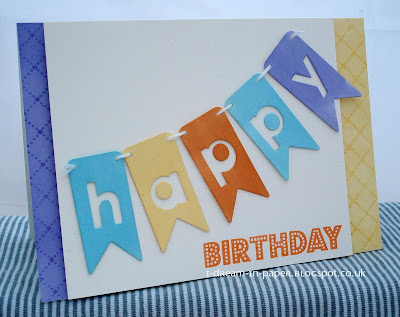
Birthday Banner

Stamps: It's Your Day (HA); Tin Types (PTI)
Ink: Tangelo (Memento); Versamark (Tsukineko)
Dies: Banners (Spellbinders); Parker Alphabet (Memory Box)
Promarkers: Cool Aqua, Buttercup, Honeycomb, Bluebell
Isn't it amazing how positioning the centres of letters to one side or the other turns a sober & serious font into a quirky one?  Discovered through ineptitude, as per usual.
 
Linking to:
CAS-ual Fridays: CFC104~ Banners & Flags
Related Posts Plugin for WordPress, Blogger...